
Running a community is exciting, but how do you know what your members actually enjoy? That is exactly where your Reports and Analytics come in!
The Analytics dashboard acts as the command center for your community’s health. It tracks real-time data to show you exactly how many people are joining, which Spaces are the most popular, and who your most active members are. By understanding these numbers, you can easily figure out what content works best and keep your community growing.
This guide will walk you through every tab of your reports and explain exactly what these terms mean in plain language.
You must have Administrator privileges in your FluentCommunity to view the Reports dashboard.
Step 1: Accessing Your Community Reports #
To start diving into your community’s data, you first need to open your analytics dashboard.
- Log in to your WordPress Dashboard.
- Click on FluentCommunity in the left-hand menu to open your community backend.
- Select Analytics from the left-hand sidebar.
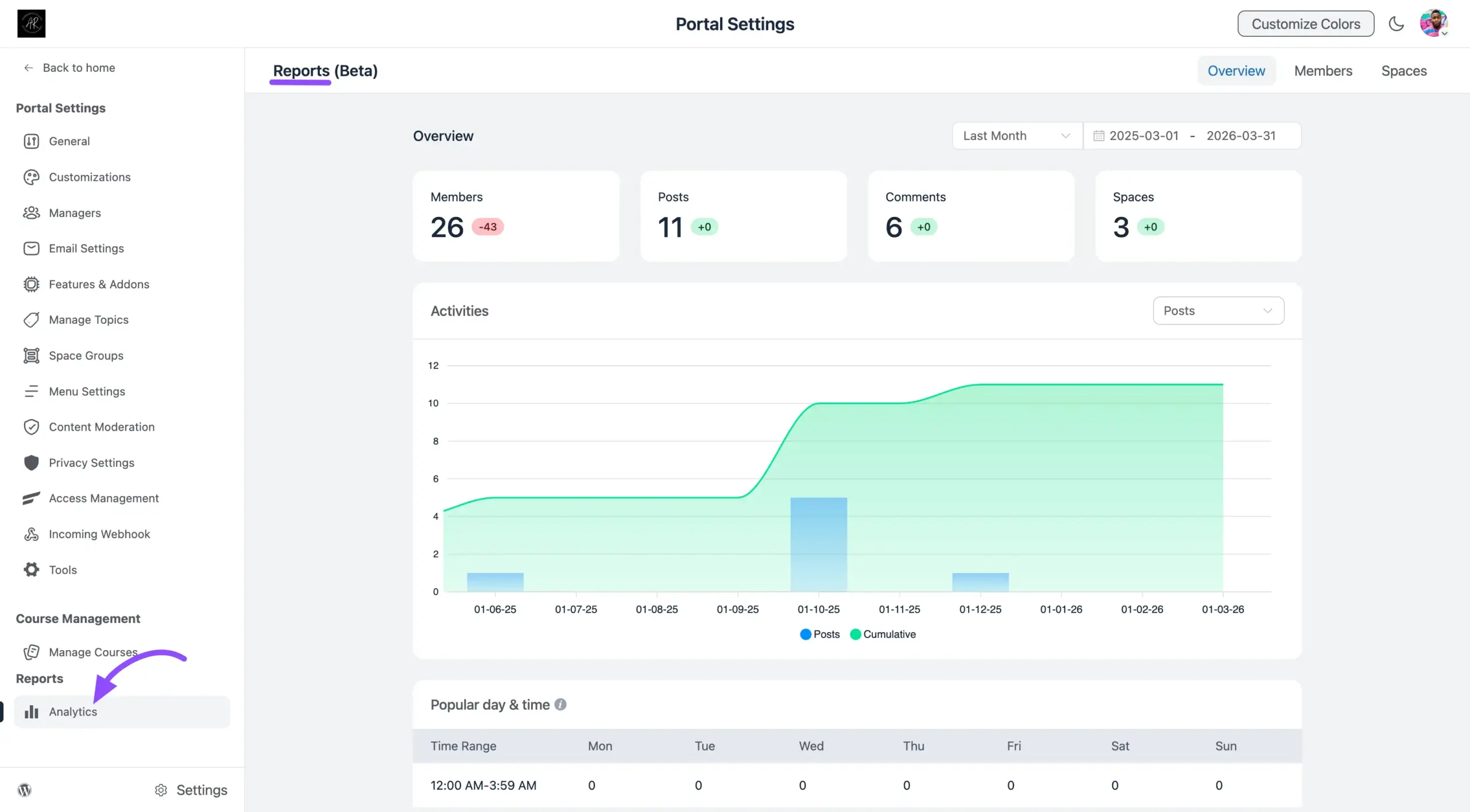
Once opened, you will see a detailed dashboard divided into four main tabs: Overview, Members, and Spaces.
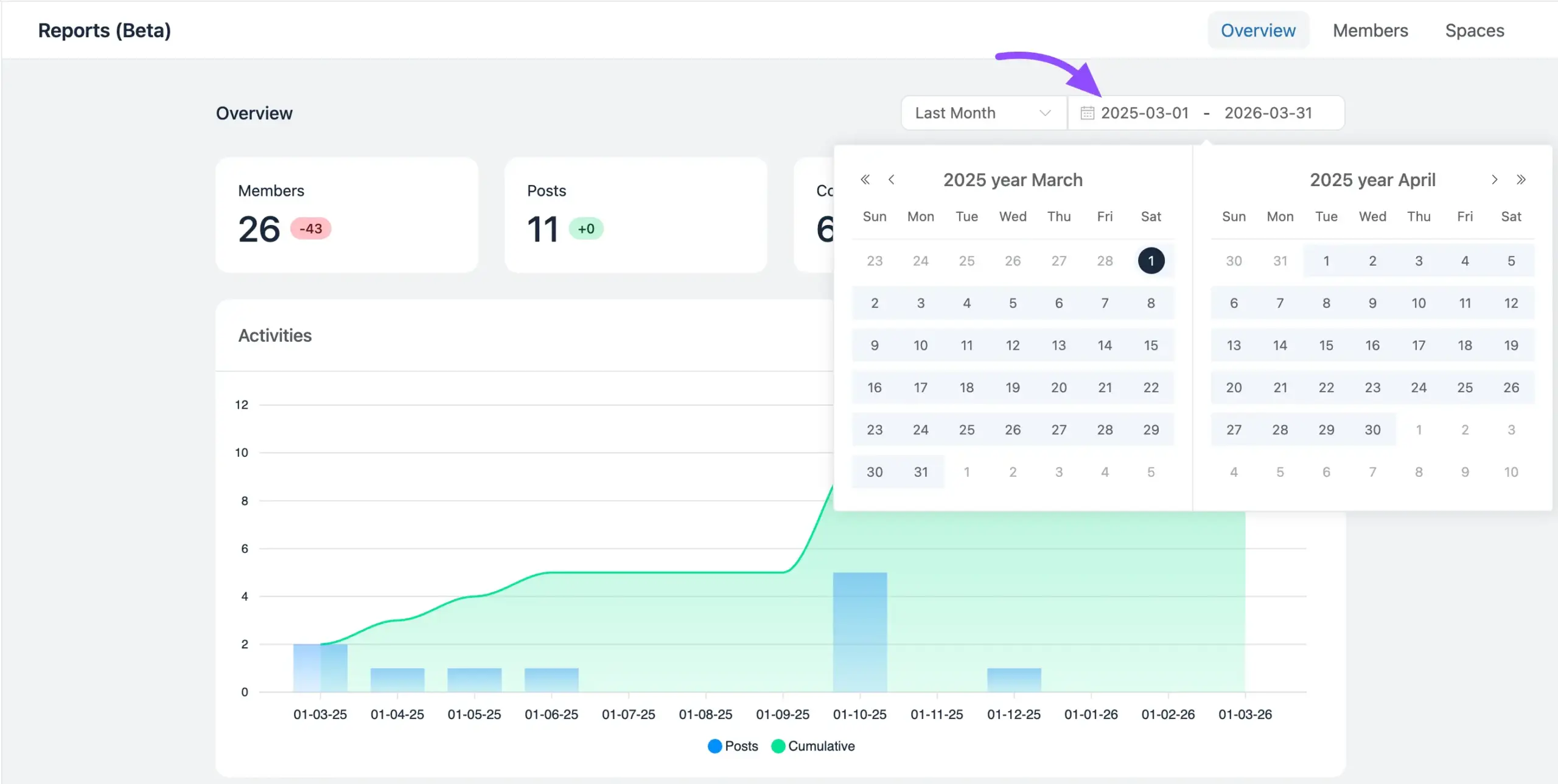
Step 2: Filtering Data by Date Range #
Before looking at the numbers, it is important to tell the system when you want to look at them. In the top-right corner of the Reports page, you will find a Date Range dropdown menu.
This filter lets you narrow down your data to a specific time period. For example, you might want to see how much your community grew this week compared to last month.
Available options include:
- Today / Yesterday: Great for checking immediate, daily activity.
- Last 7 days / Last 30 days: Perfect for weekly or monthly health checks.
- This Month / Last Month: Useful for monthly goal tracking.
- Custom Range: Allows you to select your exact start and end dates on a calendar.
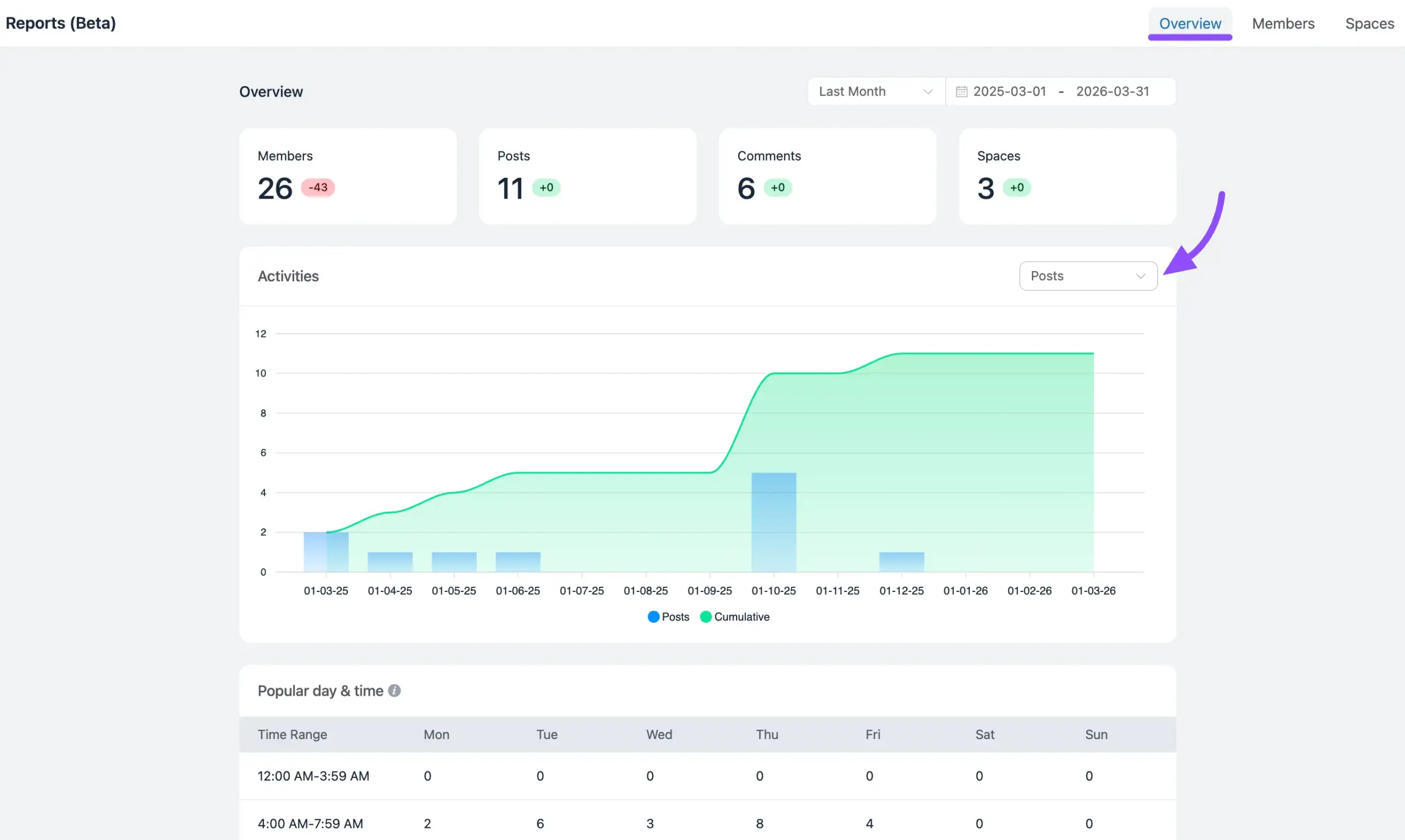
Step 3: Exploring the Overview Tab #
The Overview tab is the first screen you see, providing a high-level visual summary of your community’s overall heartbeat.
- The Main Graph: This interactive chart shows a line graph of your growth over your selected date range. You can see lines for Members (people joining), Posts (new discussions), Comments (replies), and Spaces (new groups created).
- Popular Day and Time (Heatmap): Below the graph, you will find a visual schedule showing exactly when your members are online and engaging. Darker colors usually mean more activity.
- Chart Filter Dropdown: Located right inside the chart area, you will find a handy dropdown menu. This tool allows you to adjust the timeline view of the graph, grouping your data Posts, Comments, and Members so you can easily spot short-term spikes or long-term trends of this.
🔍 Example: If your Popular Day and Time heatmap shows that your community is most active on Thursdays at 6:00 PM, that is the perfect time to publish your most important announcements or host a live Q&A session!
Step 4: Analyzing the Members Tab #
Click the Members tab to get a deeper understanding of the people inside your community. This tab breaks down who is joining and who is participating.
Top Metric Cards (The Big Numbers):
- Total Members: The absolute number of people who have joined your community.
- Active Members: Members who have recently logged in and interacted.
- New Members: People who joined during the date range you selected.
- Pending Members: Users who have applied to join but are waiting for an Admin to approve them.
Leaderboard Insights (Your Star Players):
Scroll down to see detailed tables that rank your most engaged users.
- Top Members: Users with the highest overall engagement across all activities.
- Post Starters: The conversation starters! These are the members who create the most new posts.
- Top Commenters: The conversationalists! These members frequently reply to others and keep discussions alive.

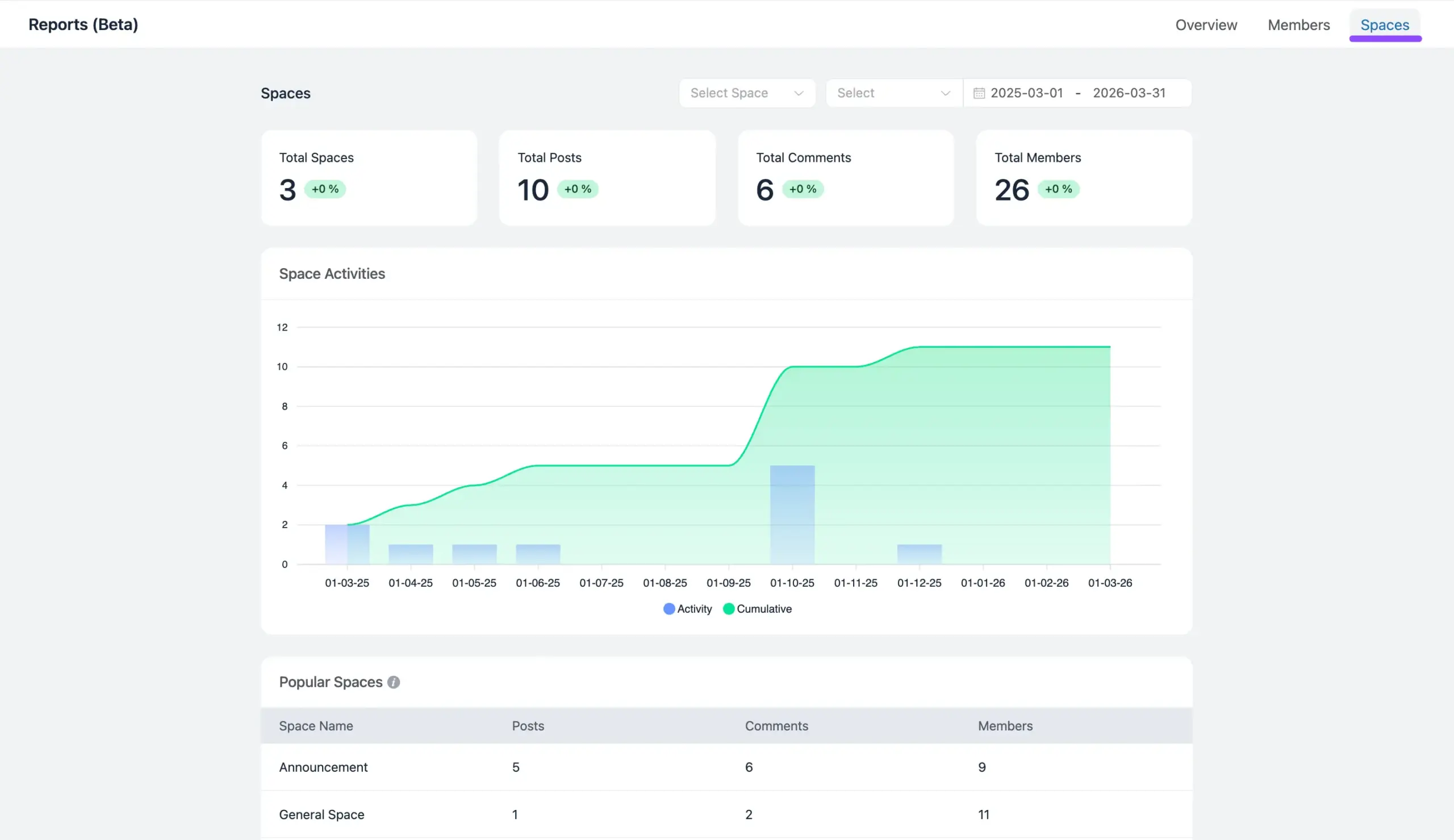
Step 5: Monitoring the Spaces Tab #
Spaces are the different groups or categories in your community. Switch to the Spaces tab to see which specific topics are thriving.
- Top Metric Cards: Get a quick count of your Total Spaces, the Total Posts and Total Comments made inside them, and the Total Members who have joined them.
- Popular Space Table: This table ranks your individual Spaces by how active they are.
Use these insights to enhance engagement, retain members, and grow your community effectively. If you have any questions about this article, feel free to reach out to our support team.