
How to Customize Your Community Portal with FluentCommunity

Table of Content
Subscribe To Get
WordPress Guides, Tips, and Tutorials


When someone lands on your community for the first time, they’re not just looking at features. They’re deciding whether this feels like a place they belong. And that decision happens fast, sometimes within seconds of arriving on the page.
A generic-looking portal can make even the most active community feel impersonal. If everything looks like it came straight out of the box, members may assume the community itself is just as unfinished. First impressions carry weight, even in online spaces.
That’s why customization matters. Not to add unnecessary decoration, but to make the space feel like it was actually built for the people in it. When the colors match your brand, when there’s a proper welcome message waiting for new visitors, and when every page feels like it belongs to the same experience, the community feels more real.
FluentCommunity gives you real control over how your space looks, from the colors on your navbar to the first message a new visitor reads. And you don’t need to write a single line of code to do it.
This guide walks through three customization features: Color Customization, the Welcome Banner, and the Theme Compatibility feature, and what each one actually does.
Color Customization: Make It Look Like Yours
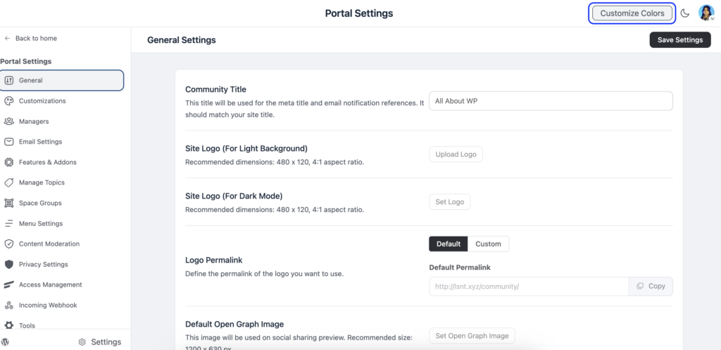
The Color Customization feature lets you change the colors across your entire FluentCommunity portal. This includes your navbar, sidebar, feed area, links, text, and buttons. You can match it to your brand or set it up however feels right for your community.
To get started, go to the Settings page inside FluentCommunity and click the Customize Colors button in the top-right corner.
One thing worth knowing right away, FluentCommunity has both a light mode and a dark mode, and you can customize colors for each one separately. So if your community members switch between modes, the colors will still feel intentional and consistent.
Light Mode
When you open the color settings, you land on the Light Mode tab. From there, click the arrow inside the Color Schema box to open a dropdown. You’ll see a list of pre-built color templates you can choose from, or you can select the Custom option to set your own.
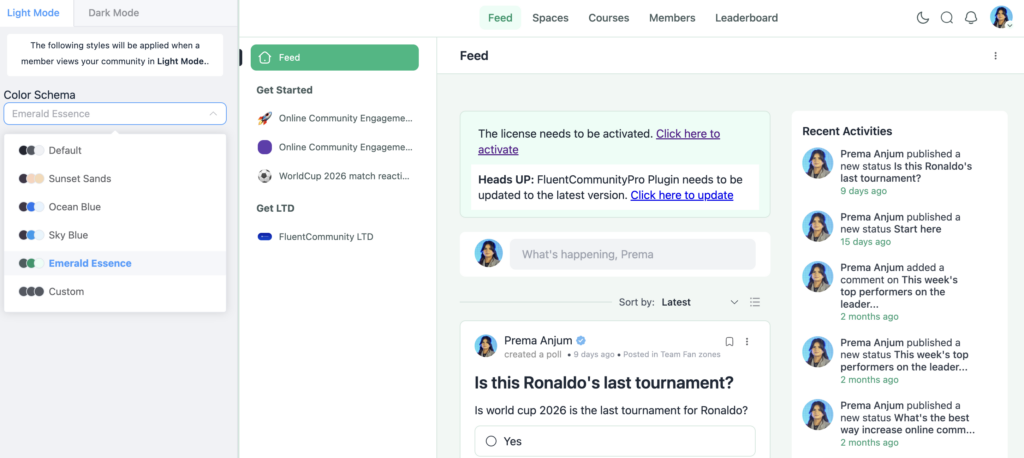
The custom option gives you three sections to work with:
Header: Covers the top navigation area of your portal.
Sidebar: Controls the sidebar colors, which members see every time they browse spaces or navigate between sections.
General: Handles the rest: feed background, content areas, links, and buttons.
Once you’re happy with the changes, hit Save Settings.
Dark Mode
After you’ve sorted out the light mode, switch to the Dark Mode tab and follow the same process. The options are identical. You’re just setting a separate palette for members who prefer a darker interface.
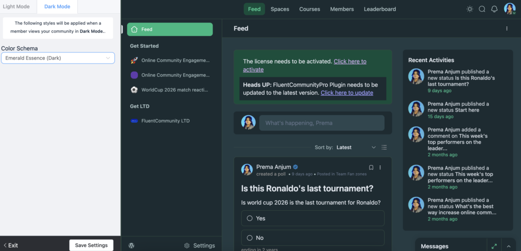
This might feel like extra work, but it’s worth doing. A community that looks polished in both modes signals to members that you’ve put thought into the experience.
The color customization feature was introduced in late 2024 and has been refined since. A styling issue with custom colors was patched in December 2024, so if you tried it early on and ran into anything odd, it’s worth revisiting.
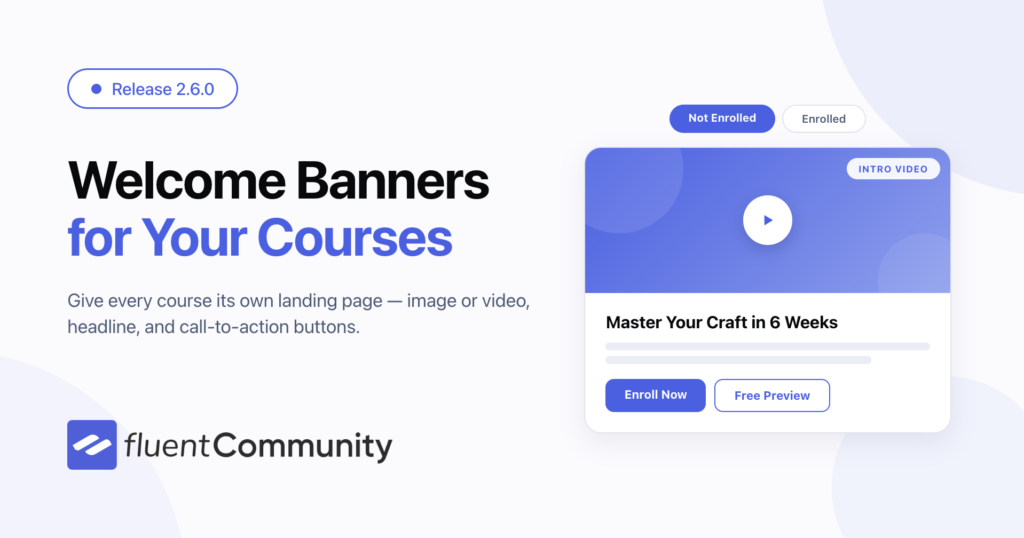
Welcome Banner: Your First Impression, Set by You
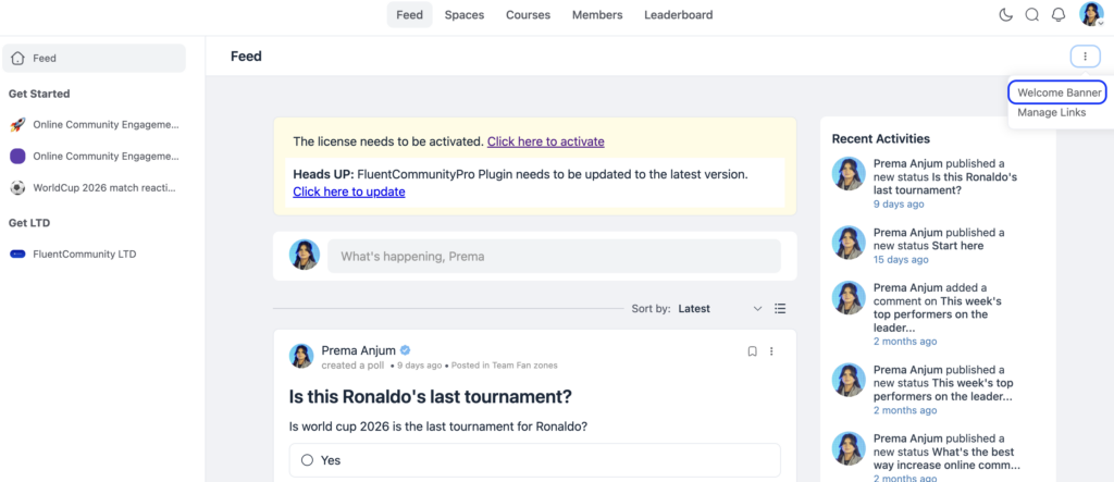
The Welcome Banner sits at the top of your global feed. Every member who lands on your community home page sees it, whether they’re logged in or not. It’s a simple but effective way to set the tone, share an announcement, point people toward something important, or make new visitors feel oriented.
Setting It Up
From your community feeds section, click the three-dot menu in the top-right corner and select Welcome Banner. A pop-up will appear with separate settings for logged-in and logged-out users.
That distinction matters. A logged-in member already knows your community, so their banner might point to a new space or announce an upcoming event. A logged-out visitor doesn’t know anything yet. For them, the banner is an invitation.
For each audience, you can toggle the banner on and customize it.
What You Can Add?
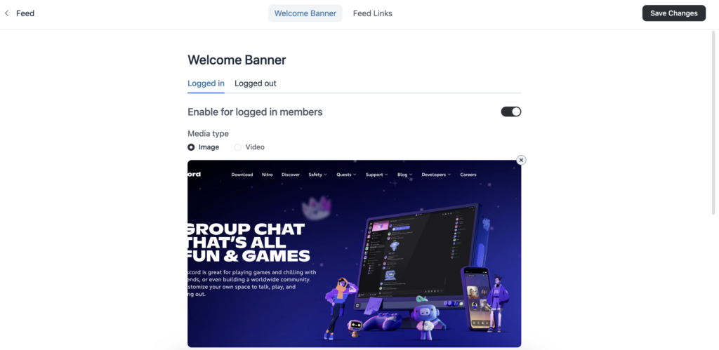
Banner Media lets you upload an image or embed a video. For video, paste a URL from YouTube, Vimeo, or Wistia and click Embed. Keeping it visual makes the banner feel more welcoming and less like a notice board.
Title and Description are a short headline and a line or two of text. Keep it clear and direct. Most members don’t read long banners.
Call-to-Action Buttons let you add multiple buttons, each with its own label, link, and style. The style options are Primary, Secondary, Text, or Link, so you can visually prioritize the most important action.
Dismissal option: If you check the “Allow members to close the welcome banner” box, members can hide it after they’ve read it. This is usually a good idea for logged-in users who see the banner every time they visit.
Once you’ve made changes, click Update Info to save.
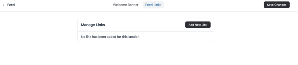
Feed Links
The same three-dot menu also gives you access to Feed Links, where you can add custom links that appear in your global feed. Each link has a name (you can even add an emoji), a URL, and an option to open in a new tab. You enable it before it goes live, so you can prepare links in draft and publish when ready.
What’s New?
In June 2026 (version 2.6.0), FluentCommunity introduced Course Welcome Banners, a version of this feature specifically for courses. So now, when a student enters a course, you can greet them with a custom banner too, not just on the global feed. This is a useful addition for anyone running paid or structured courses inside their community.
Theme Compatibility: Bring Your WordPress Theme Into the Portal
This one is a bit different from the other two. It’s not about changing colors inside the community. It’s about making WordPress pages feel like they’re part of your community portal.
By default, regular WordPress pages sit outside the FluentCommunity portal. If a member clicks a link that takes them to a standard WordPress page, it can feel like they’ve left the community entirely. The Theme Compatibility feature closes that gap.
Applying the FluentCommunity Frame to a Page
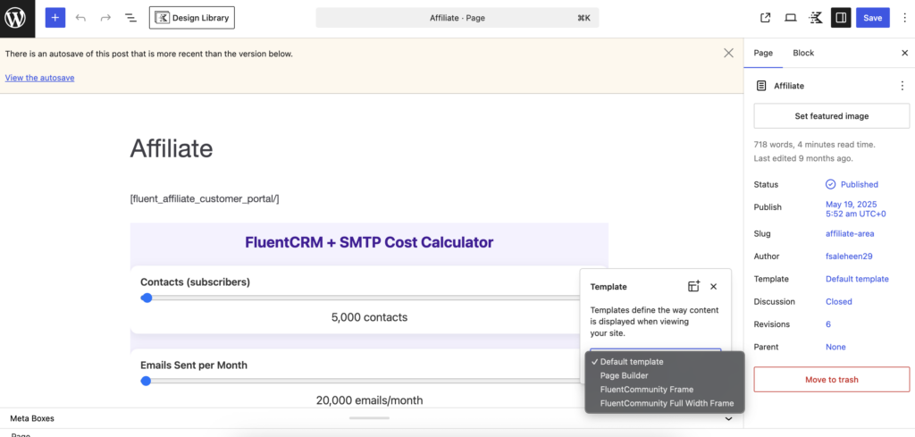
When you’re editing any WordPress page, look at the right sidebar for the Template option. Click it, and you’ll see a dropdown showing available templates, including two from FluentCommunity:
FluentCommunity Frame wraps the page in the standard portal layout.
FluentCommunity Full Width Frame does the same, but expands the content to full width if your theme supports it.
Choose one, and that page now sits inside your portal experience. Members don’t feel like they’ve gone somewhere else.
If you’re using a theme with its own editor (like Blocksy), the theme’s design options will still appear in the sidebar. You can use those to style the page further before saving.
Creating Templates with the Block Editor
For those using a WordPress block theme, there’s a more advanced option. You can go to Appearance → Editor → Templates and create or edit templates using the FluentCommunity Page Layout block.
Inside the template editor, you can remove default elements like headers and footers, drag sections into the FluentCommunity block layer, and adjust layout settings. Width can be set to default or full, and there’s an option to disable dark mode for specific templates, which is useful if a particular page should always display in light mode regardless of a member’s preference.
There’s also an Advanced section where you can add custom CSS for that template specifically.
Theme Support
FluentCommunity works with Blocksy, Astra, Kadence, GeneratePress, OceanWP, Neve, Hello Elementor, and Bricks. It’s also fully compatible with WordPress’s default block themes. Other themes may work too, though some features might not behave perfectly depending on how the theme is built.
Updates
The Theme Compatibility feature launched with version 1.5.0 in April 2025. Version 2.1.0 in November 2025 added support for Breakdance, so if that’s your theme of choice, you’re now covered.
Putting It All Together
These three features work well together. You can set up colors that match your brand, greet members with a banner that tells them what to do next, and make sure any WordPress pages they visit feel like a natural part of the community, not a detour.
None of them requires technical knowledge to use. The color settings are just a few clicks away. The banner setup is a form. The theme frame is a dropdown in the page editor.
If you haven’t explored these yet, the customization settings are a good place to start. A community that looks like it was built with intention tends to attract members who stick around.
Prema Anjum
My full name is Anzuman Ara Chowdhury. But people know me as Prema Anjum. I’m a Digital Marketer by profession, a WordPress community contributor, and a travel enthusiast by heart.
Leave a Reply