

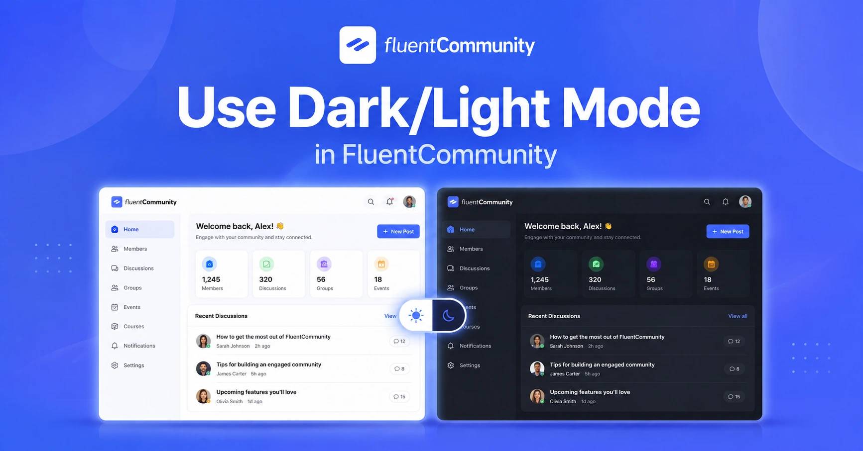
How to Use Dark/Light Mode in FluentCommunity to Give Members a Better Reading Experience

Table of Content
Subscribe To Get
WordPress Guides, Tips, and Tutorials


Members spend more time in your community than almost any single piece of content you create, scrolling the feed, reading discussions, working through course lessons. Over a long session, small details in how comfortable that experience is start to matter more than they seem to at first glance, and screen brightness is one of the biggest ones.
Some members read best with a clean, bright interface. Others, especially those browsing late at night or spending long stretches inside your community, prefer a darker screen that’s easier on the eyes. Forcing everyone into a single fixed appearance ignores a preference that’s become a basic expectation across most modern apps and platforms.
Dark/Light Mode in FluentCommunity exists to remove that friction entirely. It lets each member choose the appearance that’s most comfortable for them, without affecting anyone else’s experience. This small feature quietly improves how long people are willing to stay engaged.
What Does Dark/Light Mode Actually Do?
Dark/Light Mode lets members switch between a light-themed and a dark-themed version of your community’s interface. The underlying content, posts, courses, and Spaces stay the same; only the visual presentation changes: background colors, text contrast, and overall brightness adjust based on which mode is selected.
This is a per-member preference, not a community-wide setting, meaning each person can choose what works best for them individually, and that choice typically persists across sessions so they don’t need to reset it every time they log in.
Importance of the Dark/Mode in a Community
It reduces eye strain during longer sessions. Members working through a course lesson, reading a long discussion thread, or browsing your community for an extended period benefit from being able to choose a display mode that’s genuinely more comfortable for their eyes.
It respects a now-standard user expectation. Most major apps and platforms members use daily already offer this choice. A community without it can feel dated or less polished by comparison, even if everything else about it is well designed.
It accommodates different environments and habits. A member browsing during the day in a bright room and one browsing at night in a dark room have genuinely different needs; dark/light mode meets both without requiring either to compromise.
It’s a small but real signal of a well-built product. Details like this don’t drive people to join a community on their own, but they contribute to an overall sense that the platform was built with real care, which shapes how members perceive everything else about it.
How Dark/Light Mode Works in FluentCommunity?
Members can typically find the toggle for Dark/Light Mode in their account or display settings, often represented by a sun or moon icon in the navigation bar or settings menu.
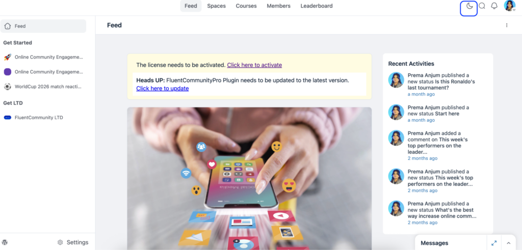
Clicking the toggle switches the interface immediately, with no page reload or waiting required.
The selected mode is generally remembered for that member going forward, so they don’t need to reselect it every time they return.
Some setups may also respect a member’s device or browser-level preference automatically, matching your community’s appearance to whatever mode their system is already set to, light or dark.
As an admin, there’s typically little to configure here beyond making sure the feature is enabled and that your community’s branding (logos, custom colors) looks correct in both modes, not just the one you personally prefer.
Checking Your Branding in Both Modes
If you’ve customized your community’s branding, logos, colors, and custom Space cover images, it’s worth checking how everything looks in both light and dark mode specifically, not just the mode you happen to use yourself.
A logo designed with a transparent background that looks great on a light background can become invisible or hard to read against a dark one, and vice versa. Take a few minutes to switch to the mode you don’t typically use and review your community’s overall appearance, catching any visual issues before members do.
Use Cases by Community Type
Course creators benefit from offering dark mode, particularly for students working through lessons late at night or during long study sessions, when a bright interface can be genuinely uncomfortable over time.
Coaches running communities with members across many time zones will have some members active during their own late hours; dark mode accommodates that naturally without any extra effort.
Brands managing customer communities benefit from offering both modes simply because customer preferences vary, and removing this as a point of friction keeps the focus on the actual product discussion.
Nonprofits and clubs with a broad, varied membership base benefit from accommodating different personal preferences without needing to pick one aesthetic that satisfies everyone.
Professional networks benefit from the polish this feature adds; professionals browsing during work breaks or in different lighting environments appreciate having the choice rather than being locked into one fixed appearance.
Common Mistakes to Avoid
A few habits are worth watching for once Dark/Light Mode is live in your community:
- Don’t assume your own preference reflects your entire community’s. Just because you prefer one mode doesn’t mean most of your members will; offering both is what actually serves a diverse group.
- Don’t neglect testing your branding in the mode you don’t personally use. It’s an easy detail to overlook, and it’s usually members who discover the mismatch first.
- Don’t treat this as a purely cosmetic, unimportant setting. While it won’t single-handedly drive engagement, it contributes to the overall sense of polish that shapes whether your community feels professionally built.
Why This Detail Shapes First Impressions?
New members form an impression of your community within seconds of landing on it, long before they’ve read a single post. Small interface details, whether the platform feels modern, well-maintained, and considerate of the person using it, contribute heavily to that first, mostly unconscious judgment.
A community that offers the display flexibility members already expect from nearly every other app they use daily reads as current and well cared for. One that doesn’t can feel slightly behind, even if the actual content and community itself are excellent. This isn’t about the feature being important on its own merits; it’s about what its presence or absence quietly signals about the overall quality of what you’ve built.
Accessibility Considerations Worth Understanding
Beyond simple preference, display mode can matter for genuine accessibility reasons. Some members with visual sensitivities or specific eye conditions find one mode meaningfully more comfortable or usable than the other, not just preferable, but necessary for a comfortable experience.
Offering both modes means you’re not inadvertently creating a barrier for members who need a specific display setting to engage comfortably. It’s a small, easy accommodation to make, and one that costs you nothing to offer, while potentially making a real difference for a portion of your community who might otherwise find long sessions in your community genuinely uncomfortable.
Quick Questions on Dark/Light Mode
Will switching modes affect anything other than appearance?
No. The underlying content, posts, courses, and member data stay the same. Only the visual presentation changes.
Does each member need to set this every time they visit?
No, the selected mode is typically remembered for that member across future sessions, so it’s a one-time choice rather than something they need to reset repeatedly.
Should I pick one mode and disable the other to keep things simple?
It’s generally not worth it. The setup cost of supporting both is low, and restricting members to a single mode removes a comfort and accessibility option at very little actual benefit to you as the admin.
Final Thoughts
Dark/Light Mode is a quiet feature that most members won’t comment on directly. They’ll simply use whichever mode suits them and move on. But removing that friction, letting each member choose what’s comfortable rather than forcing a single fixed appearance, is exactly the kind of small detail that adds up to a community that feels considered and well-built, not just functional.
Prema Anjum
My full name is Anzuman Ara Chowdhury. But people know me as Prema Anjum. I’m a Digital Marketer by profession, a WordPress community contributor, and a travel enthusiast by heart.
![SEO Title: 5 Best Community Portal Software [WordPress + SaaS Options]](https://fluentcommunity.co/wp-content/uploads/2026/10/community-portal-software-featured-1-1024x536.webp)
Add your first comment to this post