

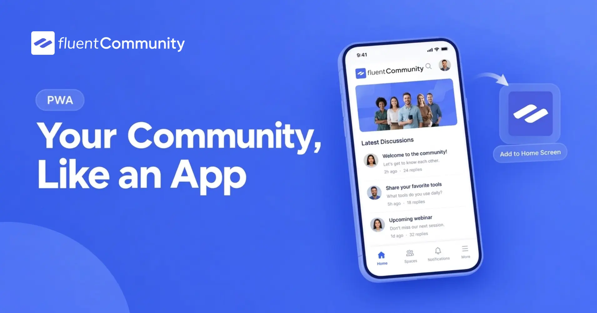
How to Use the Progressive Web App (PWA) Feature in FluentCommunity

Table of Content
Subscribe To Get
WordPress Guides, Tips, and Tutorials


Every time a member opens your community from a browser tab, they’re reminded it’s a website, not a destination. An address bar sits at the top, a handful of other open tabs compete for attention, and nothing on their home screen links back to it. Compare that to opening Instagram or Slack: one tap on an icon, no browser chrome, no distractions, just the app.
That gap matters more than it seems. Members who have to remember a URL, dig through browser bookmarks, or scroll past a dozen other tabs to get back to your community check in less often. Not because they lost interest, but because you made returning slightly harder than it needed to be.
The Progressive Web App module in FluentCommunity closes that gap without requiring you to build and submit an actual native app to the App Store or Google Play. It lets members install your community directly to their phone or desktop home screen, with your branding, your icon, and no browser bar in sight. This post covers what it does, why it’s worth setting up, and exactly how to configure it. Note upfront: this is a Pro feature, not available on the free plan.
What the PWA Module Actually Does?
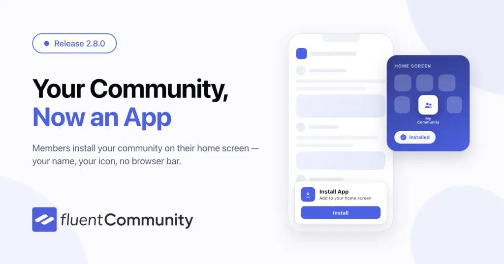
Once enabled, an Install App button appears in your community’s portal sidebar. One tap, and the community gets added to a member’s home screen or desktop like a native app, complete with your icon, your app name, and its own loading screen. There’s no App Store submission, no developer account, no review process. It’s still your same FluentCommunity site underneath, just presented without the browser interface around it.
You control the details: the app’s name, its short home-screen label, the color of its splash screen while it loads, its icon, and exactly where the install prompt shows up in your sidebar. Installed correctly, most members won’t realize it isn’t a “real” downloaded app at all.
Why This Matters More Than It Seems
It removes the single biggest piece of friction between a member and your community: finding it again. An icon on the home screen is one tap away. A browser bookmark, or worse, a search through email for the original invite link, is not.
It makes your community feel like a product, not a website. Members who’ve installed your community as an app on their phone treat it differently than a bookmarked page. It sits alongside the other apps they check daily, which puts your community in the same mental category as the tools they already return to out of habit.
It costs a fraction of what a native app would. Building and maintaining actual iOS and Android apps means developer accounts, app store review cycles, and ongoing maintenance across two separate codebases. The PWA module gives you most of the same feel: an icon, a full-screen experience, offline-style permanence, using the community you’ve already built.
It syncs with how members already use their devices. The installed app automatically matches a member’s device-level light or dark mode preference, so it behaves consistently with everything else on their home screen.
Enabling the PWA Module
- Open your community portal and click Settings at the bottom of the left sidebar.
- In Portal Settings, click Features & Addons, then open Advanced Features & Addons.
- Scroll down to Progressive Web App (PWA) and click its Settings button.
- Check the box to Enable Progressive Web App (PWA) at the top of the configuration drawer.
Once enabled, the module’s status on the Advanced Features & Addons list changes to Enabled, and the install button becomes available to members.
Configuring Your App Branding
This is where the feature stops being generic and starts looking like yours.
- App Name: The full name shown on the installation popup and loading screen. It defaults to your portal’s community name, but you can change it to anything you’d want a member to see on that first install prompt.
- Short Name: A brief label, capped at 12 characters, that appears directly under the icon on a member’s home screen. Leave it blank and it reuses your App Name, though anything longer than 12 characters will get cut off on the home screen itself, so it’s worth setting this deliberately rather than leaving it to chance.
- Splash Screen Color: The solid background color shown while the app loads. Leave it blank, and it matches your default portal background automatically.
- App Icon: Choose Default to reuse your existing site logo, or Custom to upload a dedicated app icon.
One detail worth taking seriously: a custom icon must be a perfectly square image, no larger than 512×512 pixels. Mobile browsers reject oversized images outright, which breaks the install button entirely rather than just displaying it imperfectly. Size your icon correctly before uploading, not after members start reporting a missing button.
Configuring the Install Button
Beyond branding, you control exactly where and how members encounter the install prompt itself.
- Show Install App in portal menu (mobile only): Adds the Install App button directly into your sidebar.
- Allow members to hide the install button: Lets members dismiss the prompt manually. If they close it, it stays hidden for 7 days before reappearing, which respects members who aren’t ready to install yet without removing the option permanently.
- Install Button Position: Choose Sidebar Top or Sidebar Bottom for your main portal menu.
Click Save Settings at the bottom of the drawer to lock in your configuration.
How Members Actually Install Your App
The install experience isn’t identical across every device, and it’s worth knowing the difference before members start asking why the button isn’t where they expected.
For Android and desktop users, it’s a single tap. They click Install App in your sidebar, and the community is added to their home screen or desktop immediately.
For Apple iOS users, Safari doesn’t support one-tap install buttons at all, that’s an Apple platform limitation, not something FluentCommunity can work around. iPhone and iPad members need to tap their browser’s native Share icon and select Add to Home Screen instead. If a meaningful share of your community is on iPhone, it’s worth a short pinned post or a line in your welcome message explaining this extra step, since it isn’t obvious on its own.
A Note for Developers
If you’re managing this for a client or an agency, several filters are available for finer control: the install button’s text, the app’s theme color, and its screen orientation. That means you can tailor the PWA experience per client without needing to expose extra settings screens to them directly.
What This Looks Like in Practice?
Picture a course-based coaching community that’s been running for a year, entirely accessed through a browser bookmark. Engagement is solid among people who remember to check in, but the coach keeps hearing the same thing from newer members: “I forgot this existed until your email reminded me.”
After enabling the PWA module, uploading a square version of the community’s logo, and setting the app name to match the brand, the coach adds a short post walking members through the one-tap install on Android and desktop, and the Share-menu steps for iPhone users. Within a couple of weeks, a noticeable share of active members have the app icon sitting on their home screen next to everything else they open daily. The community hasn’t changed. Where it lives on a member’s phone has.
Common Mistakes to Avoid
Uploading an icon larger than 512×512 pixels, or one that isn’t perfectly square, breaks the install button rather than just looking slightly off. Check the exact dimensions before uploading, not after.
Leaving the Short Name blank when your App Name is long is worth double-checking. A long name gets truncated under the icon on a member’s home screen, which can look unfinished even though the setup itself was correct.
Assuming iOS and Android members have the same install experience causes confusion. Since Apple blocks one-tap installs entirely, iPhone and iPad members need explicit instructions, not just a button they’re waiting to find.
Enabling the feature and never mentioning it to your community, which means most members simply never notice a sidebar button they weren’t expecting. A brief announcement post gets far more installs than the button sitting there silently.
Final Thoughts
The Progressive Web App module doesn’t change anything about what your community does; it changes how present it feels in a member’s daily routine. An icon on the home screen, a branded loading screen, no browser bar in sight- all of it moves your community from “a website I visit sometimes” to “an app I check like everything else.” Set the branding carefully, size your icon correctly the first time, and make sure your community actually knows the option exists once it’s live.

Prema Anjum
My full name is Anzuman Ara Chowdhury. But people know me as Prema Anjum. I’m a Digital Marketer by profession, a WordPress community contributor, and a travel enthusiast by heart.
Add your first comment to this post