Brand Resource
Welcome to FluentCommunity’s brand resource page. This page provides guidelines, logos, and assets to ensure consistent and professional representation of the FluentCommunity product.

FluentCommunity Logos
Our logos represent the visual cornerstone of our brand, supporting our identity, credibility, and recognition. This section provides all the essential assets and guidelines to ensure consistent and accurate logo usage across all platforms and media.
Primary Logo
Secondary Logo
Monotone Dark Logo
Monotone White Logo
FluentCommunity Icons
Our icons form the visual foundation of our brand, representing our identity, credibility, and recognition. This section includes everything needed to ensure consistent and accurate icon usage across all platforms and media.
Primary Icon
Secondary Icon
Monotone Dark Icon
Monotone White Icon
FluentCommunity Logo Usage Guidelines
The FluentCommunit logo pairs our distinctive abstract primary icon with the FluentCommunity wordmark.
The primary horizontal version is recommended for most applications.
To maintain clarity and impact, avoid using the logo at sizes that compromise legibility, and always use the official logo files provided.
Logo Scale Guidelines
For smaller applications, use the dedicated small-size logo variation. It’s optimized for widths between 140px and 240px to maintain clarity and visual balance.
When the logo needs to appear even smaller, between 30px and 70px in height, use only the FluentCommunity icon. Avoid using the stacked logo at these sizes to preserve readability and brand consistency.
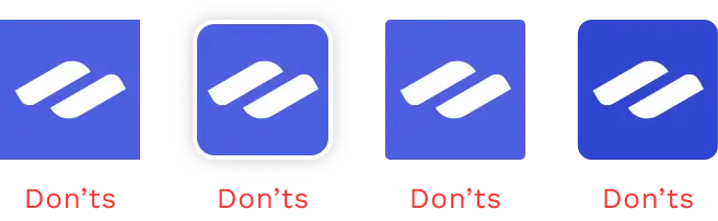
Dos and Don’ts
When it comes to using our logos, there are several important dos and don’ts to keep in mind. First, always ensure that you use the logos in their original form without any alterations.

Do
Use the full-color logos only on white or black backgrounds. When placing the logo on a photograph, ensure the logo is positioned over a white, black, or lighter area of the image to maintain visibility.


Don’ts
Don’t use the full-color logo on any background that fails accessibility. Always make sure it’s easy to see and has proper visual contrast. And do not alter any part of the logo’s color (logomark and wordmark).


Brand Color Palette
Apply these color proportions consistently across all layouts and marketing materials. Text should always appear in dark grey (Text Color). Use the secondary color for buttons and key focus areas. The primary color is FluentCommunity’s core brand color and should be used as a neutral base or wherever strong brand representation is required.
#4561E9
CMYK 70, 58, 0, 9
Primary
Color
#351A70
CMYK 53, 77, 0, 56
Secondary
Color
#50BCF0
CMYK 67, 22, 0, 6
Accent
Color
#222222
CMYK 0, 0, 0, 87
Text
Color
Icon’s Guidelines
Dos
Don’ts
Writing Guidelines
The do’s and don’ts of talking about FluentCommunity in your content or copy.